Dow 20K!
On January 25, the Dow Jones Industrial Average hit a milestone – 20,000 points. Naturally this drew a lot of attention from pundits and investors alike, attention on what lies ahead as much as what had just occurred. Of course no one can provide a forecast with any sort of legitimate certainty. And those that pretend to should be avoided at all costs. Nevertheless, it is still a chance to examine where we have come from and to assess where we stand today in the context of market cycles. Thorough analysis extends far beyond anything covered below, but I hope to share with you a few basic angles to critically think about security markets.
First, some clarification around these indices we follow…
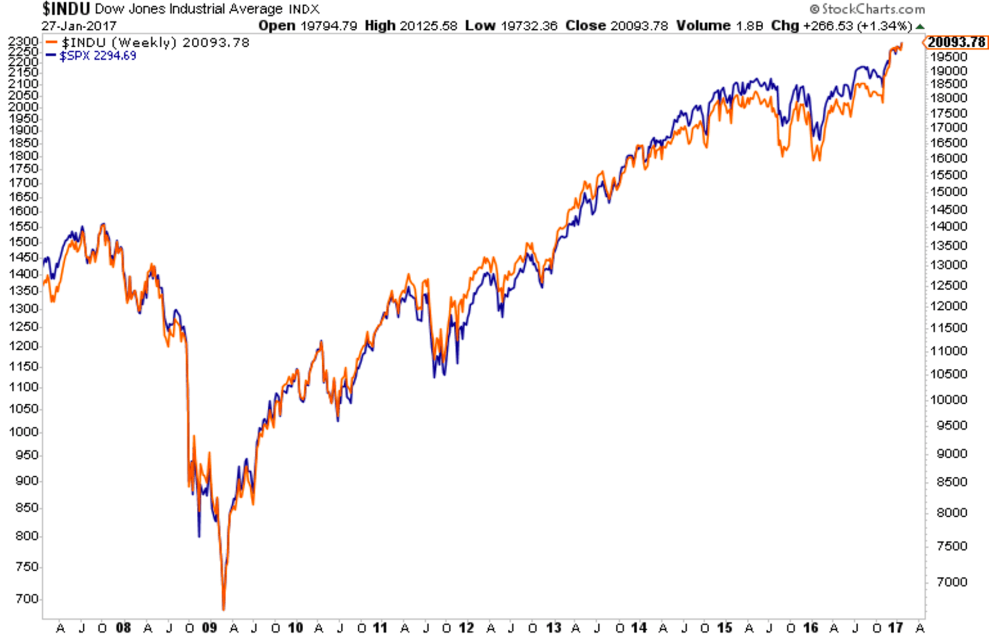
The Dow is not the index to follow. Sure it makes headlines, and yes it is one of our country’s oldest indices, but it does not represent the broad economy as many suggest or assume. First it’s only 30 companies. Second, inclusion in the index is at the discretion of the editors of the Wall Street Journal. And finally, it is a price-weighted – as opposed to market cap-weighted – index. So the price movements of the index are driven by the prices of the component stocks, not their valuations. The S&P 500 is alternative that also tracks US large cap companies – 500 of them. It is calculated on a market cap basis and is often followed more closely by the pros.
So let’s assume the S&P 500 is a better alternative as the US benchmark. How has that performed? Below shows that it has indeed performed as well as the Dow, even if it hasn’t crossed a psychologically meaningful number:
And how about if we dig down another level? Sector-specfic indices or securities tell us which parts of the economy are currently outperforming and which are lagging. Below is a trailing one year graph of each sector of the US economy, as represented by the SPDR Sector ETFs:
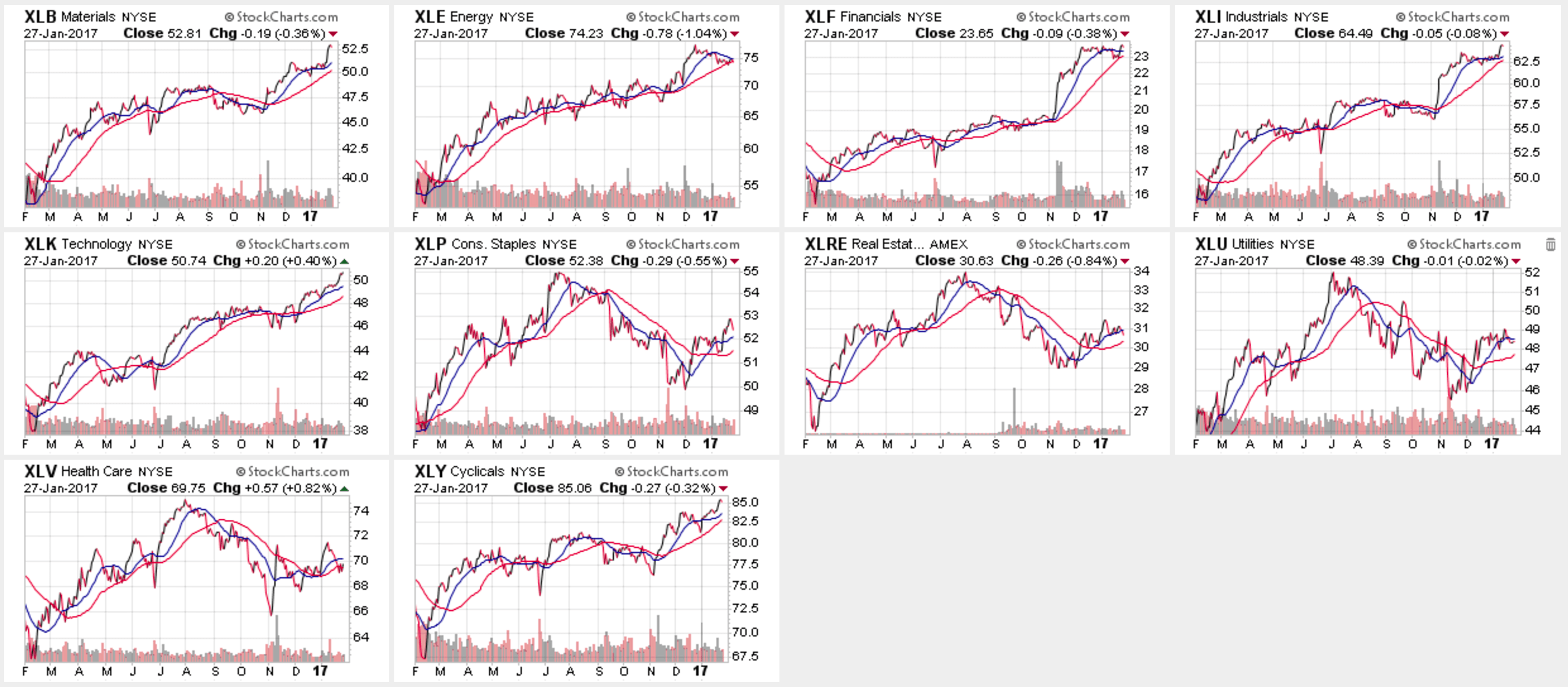
Over the last year we have seen strong upward trends in cyclical businesses such as industrial, materials, financials and energy. On the other hand, historically defensive sectors, such as healthcare and utilities, have lagged. As an added note, financials will perform better as longer term rates rise (banks lend at long rates), while utilities will underperform (they often serve as a proxy for bonds).
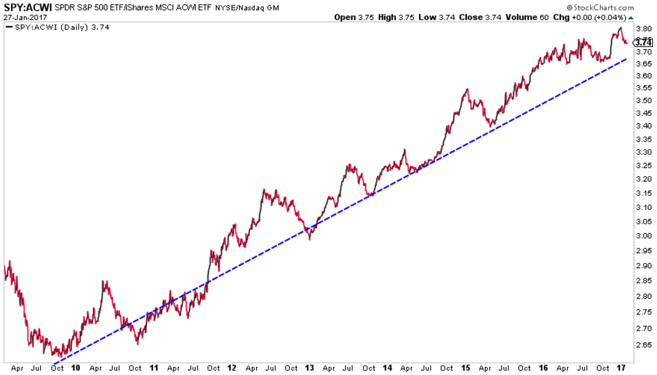
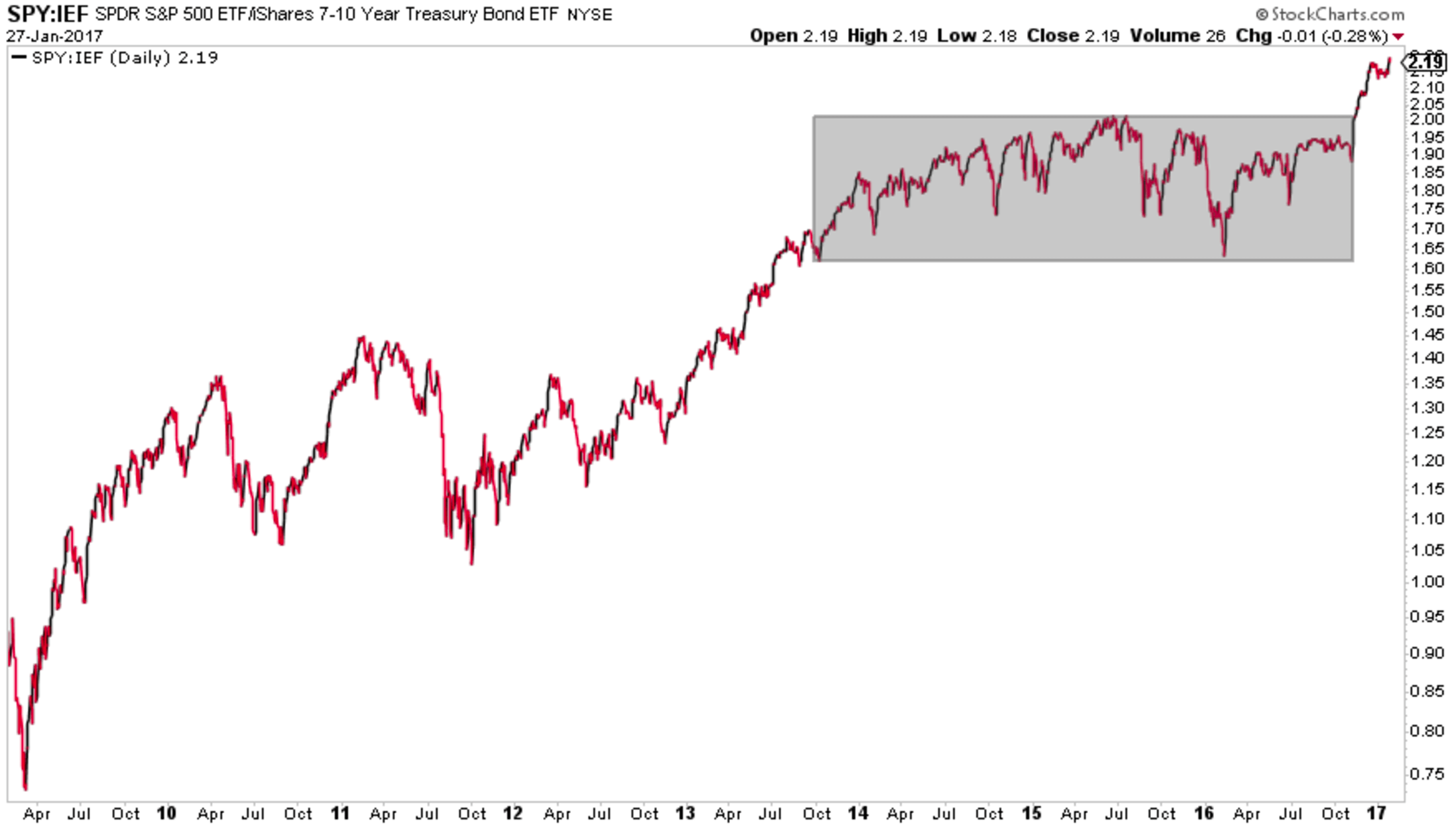
A further way to evaluate the performance of an asset class is through the lens of “relative strength”. This is the process of mashing two asset classes together on one chart to see which performs better than the other. It doesn’t tell us if either generated attractive absolute returns but rather answers the question “which asset would have been better to own?” The mechanics: the price of asset X divided by the price of asset Y (X/Y). Relative strength charts are an effective backward-looking sentiment tool. Was the market in a risk-on period or a risk-off? Was there a better opportunity in growth stocks or value stocks? Which country or region yielded the best returns?
So let’s put this to use as another way to evaluate where we’re at (Dow 20K!) and where we have come from…
Since the Global Financial Crisis US large caps have consistently outperformed international equities and the relationship has followed a very clear trend, as annotated by the dotted blue line:
US large has also outperformed US Treasuries, though the relationship has not been as linear. Stock market volatility and global negative rates over the last few years created what’s called a “range-bound” relationship between stocks and Treasuries (grey rectangle below). More recently, with rates ticking up and equity indices hitting ATHs, US stocks have broken out of this range:
The final topic I want touch on is market valuation. Is the market cheap at 20K or overbought? Again there are myriad ways to derive valuation from public equities, and I will only briefly touch on a couple.
The price to earnings (P/E) ratio is one of the most commonly cited valuation metrics. Dow 20K tells us the price, or the “P”. The market is at an all-time high!…So what? We need to introduce the earnings of the market, the “E”, to determine true value. The denominator in the P/E tells us what bang we’re getting for our buck. The current 12 month trailing PE (today’s price divided by the earnings of the total market for the last 12 months) for the S&P 500 is 25.76 (multpl.com). That’s a price of $25.76 for each dollar of earnings. On a historical basis that is expensive:
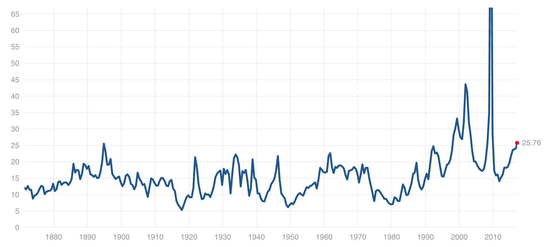
Can you spot the housing crisis of 2008? How about the tech bubble?
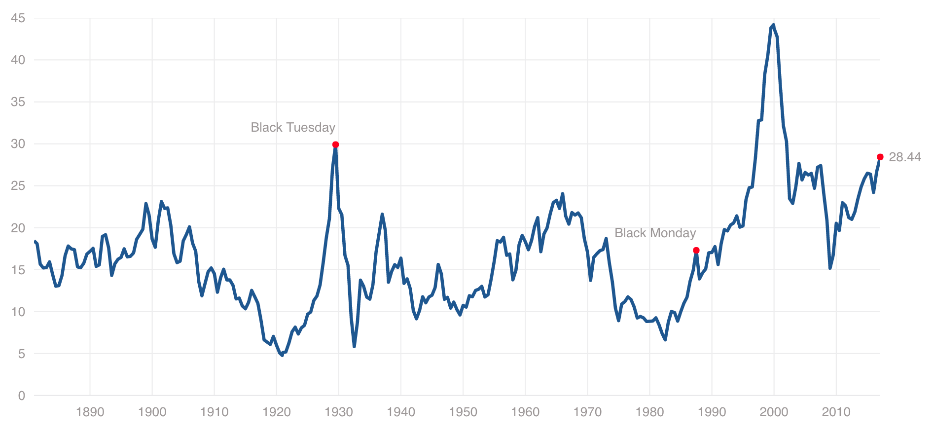
The other way to leverage this ratio is to normalize it by averaging the previous 10 years worth of earnings. This is referred to as the CAPE Ratio or the Schiller P/E. Again we see the current value of 28.44 is historically expensive:
So how can we tie this all together? Going back to my original intent, these basic tools help us evaluate where we’ve come from as US equity investors and where we currently stand. There is no doubt those who held onto US large cap stocks through ’08 and the subsequent recovery have been aptly rewarded. Further, cyclical sectors have outperformed the more defensive spaces over the last year. This, in conjunction with positive macro trends (for another discussion), and an accommodative Federal Reserve, diminishes the risk of recession at present. Of course this can and will inevitably change at some point in the future.
On a relative basis, US large caps have provided a better return profile than other major asset classes, though at this point they are now on the pricier end of the historical spectrum, at least as measured by the P/E ratio.
I hope this was helpful – if perhaps simplistic – in providing you a better understanding of the current US equity market, at least beyond “Dow 20K!”
LAYLINE ADVISORS, LLC (“LAYLINE ADVISORS”) is a registered investment adviser offering advisory services in the States of New York and Texas and in other jurisdictions where exempted. Registration does not imply a certain level of skill or training. The presence of this website on the Internet shall not be directly or indirectly interpreted as a solicitation of investment advisory services to persons of another jurisdiction unless otherwise permitted by statute. The information on this site is provided “AS IS” and without warranties of any kind either express or implied. To the fullest extent permissible pursuant to applicable laws, LAYLINE ADVISORS disclaims all warranties, express or implied, including, but not limited to, implied warranties of merchantability, non-infringement and suitability for a particular purpose. LAYLINE ADVISORS does not warrant that the information will be free from error. None of the information provided on this website is intended as investment, tax, accounting or legal advice, as an offer or solicitation of an offer to buy or sell, or as an endorsement of any company, security, fund, or other securities or non-securities offering. The information should not be relied upon for purposes of transacting securities or other investments. Your use of the information is at your sole risk. Under no circumstances shall LAYLINE ADVISORS be liable for any direct, indirect, special or consequential damages that result from the use of, or the inability to use, the materials in this site, even if LAYLINE ADVISORS or a LAYLINE ADVISORS authorized representative has been advised of the possibility of such damages. In no event shall LAYLINE ADVISORS, LLC have any liability to you for damages, losses and causes of action for accessing this site. Information on this website should not be considered a solicitation to buy, an offer to sell, or a recommendation of any security in any jurisdiction where such offer, solicitation, or recommendation would be unlawful or unauthorized.